Dissecting the Assistant User Interface
How converging structural patterns are shaping trust, agency, and intent
AI assistants are no longer judged by how impressive their demos look. The bar is shifting toward something more useful and more difficult: dependable collaboration. And you can see it in the mobile UI. The app interface is converging into a recognizable standard — a little boring, but very revealing.
This is a look at the default landing UI on first load (empty state) across products. Here’s a grounded breakdown: header, content, input. Not to celebrate uniformity, but to ask what’s being optimized, what’s being sacrificed, and why this pattern keeps winning in real products.
Structural Patterns
At a glance, every major assistant follows the same scaffolding: three horizontal bands — header, content, input. This is not a cosmetic choice. It encodes the flow of control. The header anchors system and identity. The content area frames the conversation. The input is where intent is expressed and edited.
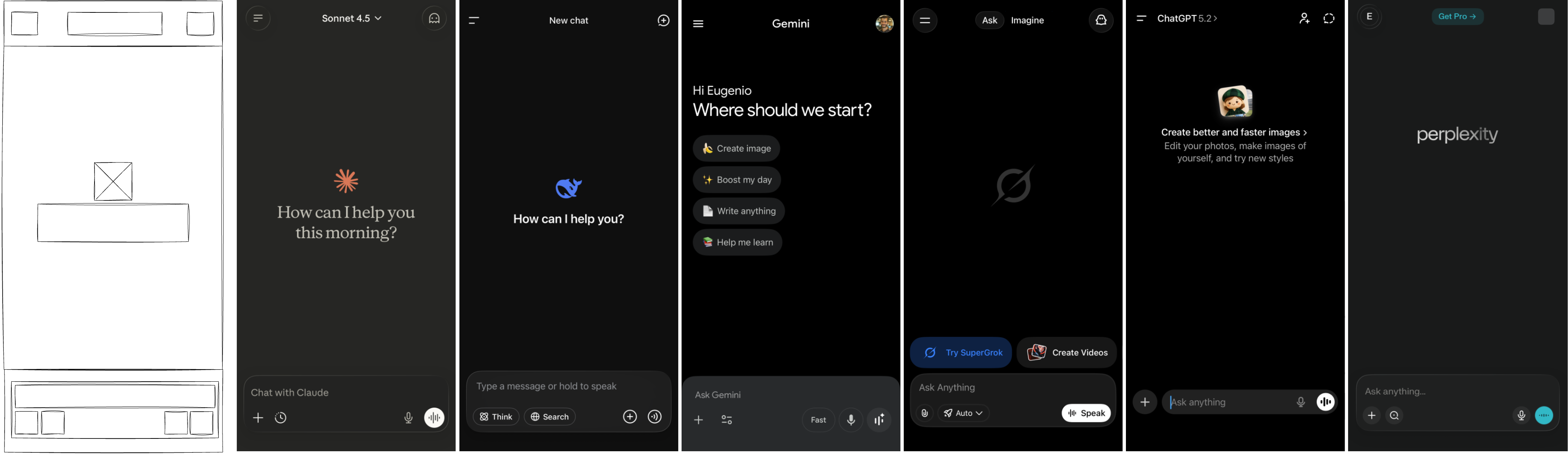
Header: System, Identity, and Mode
The header is a compact control layer. Across products it holds some mix of settings, model selection, thread navigation, identity, and temporary chat. It is the quiet place where the system asserts its boundaries and the user chooses the tool’s stance.
Patterns worth noting:
- Claude and ChatGPT make model choice and temporary chat visible.
- Gemini and Perplexity emphasize account identity and product framing (profile, upgrade banners, discovery).
- Perplexity is the only one without a visible threads/history button in the header, which positions it closer to a search engine posture (one-off queries) than a workspace posture (returning to threads over time).
- Grok adds explicit mode switching between ask and create, acknowledging that intent is not singular.
Claude, DeepSeek, Grok, and ChatGPT all expose temporary or ephemeral chats at the top level. That signals a clear demand: users want a low-stakes, privacy-respecting mode where exploration won’t pollute history or memory. It’s an admission that not every question wants to be remembered - at least to the end user.
The header is the contract zone. It clarifies “what this tool is right now” before you type anything. That’s good design, and it’s also a subtle admission that the model itself is not the product. The system state is.
Content: The Empty State as Instruction
The center panel is a prompt in disguise. It orients the user with logos, greetings, and quickstart chips. This is where the system hints at how it wants to be used. The empty state is the first instruction, and it’s more influential than most teams admit.
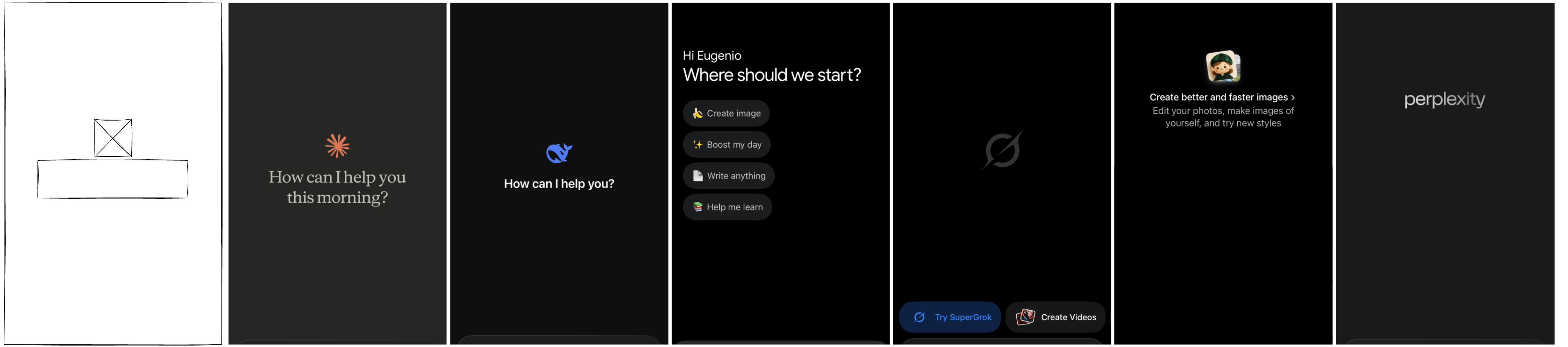
The range is telling:
- Claude and DeepSeek keep it minimal: a greeting and an invitation.
- Gemini and Grok inject quickstarts and upsells, steering toward specific actions.
- ChatGPT uses a centered banner to normalize image creation.
- Perplexity leaves it almost empty, implying “just ask.”
The content area isn’t just decorative. It primes the first action and shapes the user’s mental model of what the assistant is for. It’s also where product strategy sneaks in: upsell chips, image creation nudges, or a pure “just ask” stance. Perplexity puts its upgrade banner in the header (not the content), while Grok surfaces upgrade calls in the first-view content. Gemini’s upgrade prompt is more hidden — it shows up when you open model selection.
Input: The True Power Surface
The input row is the most complex zone. It’s where every capability is exposed or hidden. Most assistants split it into two rows: text on top, tools below. ChatGPT is the exception with a single-row, maximum-minimal design, leaning into progressive disclosure.
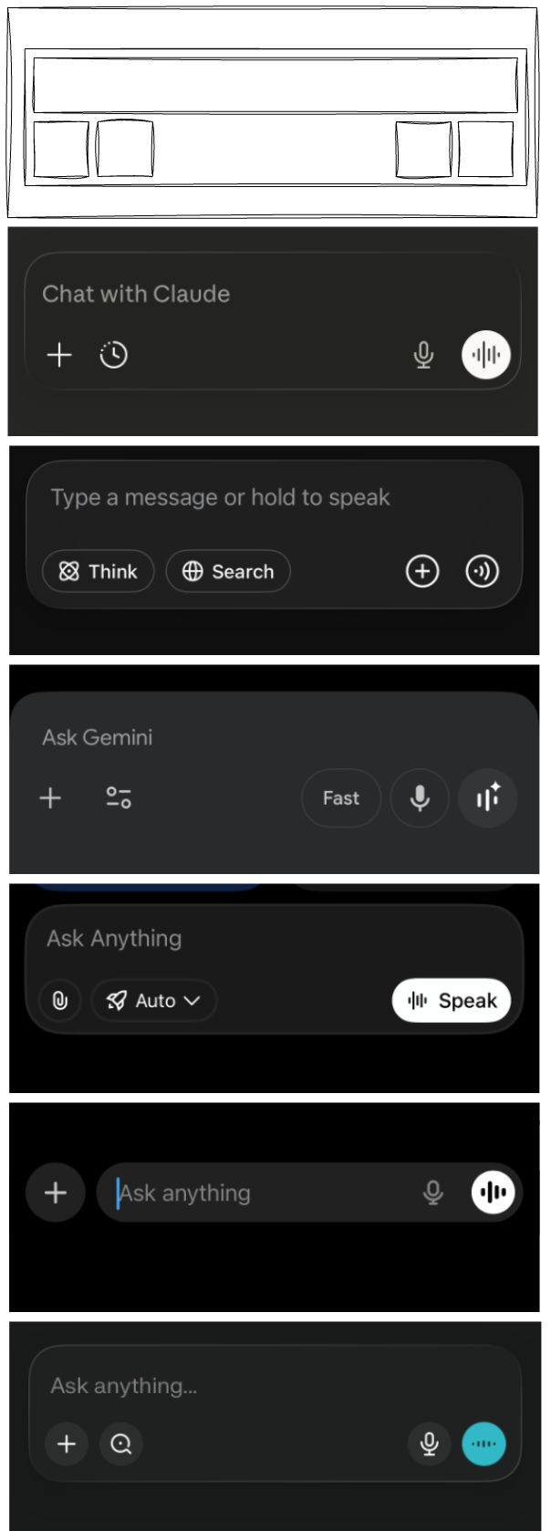
Across products, the input reveals a shared pattern:
- A primary text field with a short placeholder (“Ask anything,” “Ask Gemini,” “Chat with Claude”).
- A plus menu for attachments and special modes.
- A right-side voice cluster (dictation, live voice), with DeepSeek notably missing live voice.
- Feature toggles: research, search, image generation, learning modes, projects, apps.
- Rounded input containers across products, softening the “command box” feel and signaling friendliness.
This is where the assistant stops being a chat box and becomes a configurable system. The input is the power surface, and its design determines how much agency the user actually has.
The placeholder copy is doing quiet positioning. Claude uses “Chat with Claude,” Gemini uses “Ask Gemini,” and ChatGPT/Grok/Perplexity all use variations of “Ask anything.” DeepSeek is the most explicit about modality with “Type a message or hold to speak,” signaling voice as a first-class option. These few words nudge the user toward a certain posture: explorer, collaborator, or operator.
Controls reveal what the product expects you to do. The plus menus cluster around attachments and mode toggles, implying that the default interaction is not enough — you’re expected to bring files, switch modes, or enable research. ChatGPT’s single-row input hides the control surface until you open the menu, while Gemini and Grok keep more visible options around the input, effectively asking you to treat the assistant like a toolbelt. The more controls you see, the more the product assumes you’re ready to steer.
Search is the other signal. Most assistants offer some form of deep research or web search, but Grok stands out as the exception in the default input controls. Perplexity goes further by breaking research into intent-specific modes (academic, financial, social), which makes the user pick a lens up front instead of hoping the model infers it — and it assumes a more savvy user than the others. The others keep research more general, a broad capability boost rather than a deliberate framing choice. The fact that most providers ship some version of this suggests it’s now table stakes for delivering value, and likely a default expectation going forward.
Voice UI is its own intent signal. Most assistants use toggle recording (start/stop) and pair it with a live voice mode, which implies a continuous, conversational session. DeepSeek leans toward push-to-talk (“hold to speak”), which is closer to a walkie‑talkie model: short bursts, less commitment, fewer surprises. The emerging pattern is clear: voice is framed as either lightweight dictation or a real-time mode that feels more personal and intimate — and the chosen interaction model tells you which one they want you to use.
The Assistant Archetypes
Taken together, the header, empty state, and input form a narrative about what the assistant is for. Each product is quietly signaling its direction — what it is becoming and who it is becoming for:
- Claude: A trust-first collaborator evolving toward long-term partnership; it maximizes safety cues and low-stakes exploration, and expects a user who wants an ongoing, steady relationship.
- ChatGPT: A general-purpose workbench scaling into a configurable platform; it maximizes breadth and capability while minimizing upfront choices, and expects users to unlock power through progressive discovery.
- Gemini: A guided, multi-mode helper moving toward structured workflows; it maximizes onboarding and visible options, and expects users who want direction and clearly framed tasks.
- Grok: A mode-driven, experiment-forward assistant headed toward explicit intent switching; it maximizes clarity of stance and feature signaling, and expects users to pick a mode before asking.
- Perplexity: A research-first engine leaning into ad-hoc inquiry; it maximizes direct questioning and source-seeking, and expects users who treat it like a focused search tool rather than a workspace.
- DeepSeek: A lightweight utility shaping for quick, low-commitment exchanges; it maximizes speed and modality clarity, and expects brief, purposeful interactions.
First, we decompose each assistant on its own terms: what it emphasizes, what it minimizes, and what it expects from the user. Next, we regroup those same characteristics from different angles to show how the patterns cluster across products. Each framing uses visible UI evidence (header controls, empty states, and input affordances) to explain the positioning.
- Relationship posture: Claude and ChatGPT tilt toward ongoing partnership (temporary chat plus threaded navigation), Gemini and Grok toward guided/task-oriented use (visible mode switches and discovery/quickstarts), and Perplexity and DeepSeek toward ad-hoc utility (minimal empty state and lighter continuity cues).
- User intent expectation: Claude assumes exploration and rapport (“Chat with Claude” plus temporary chat), ChatGPT assumes general-purpose tinkering (broad tool menu behind progressive disclosure), Gemini and Grok assume directed tasks (chips, explicit “ask/create” modes), while Perplexity and DeepSeek assume quick lookup and low-commitment queries (“just ask” stance and hold-to-speak).
- Control philosophy: ChatGPT and Claude lean on progressive disclosure (single-row input or fewer exposed toggles), Gemini and Grok lean on visible guidance and explicit modes (options placed around the input), and Perplexity/DeepSeek keep the surface lean (sparser controls and empty states).
- Time horizon: Claude and ChatGPT signal continuity (threads/history and temporary chat for safe long-term use), Gemini and Grok suggest session-scoped workflows (mode switching and quickstarts), and Perplexity/DeepSeek feel optimized for one-shot interactions (no visible threads in Perplexity, push-to-talk in DeepSeek).
- Persona metaphor: Claude reads as a collaborator (relational copy and trust cues), ChatGPT as a workbench/platform (broad capabilities with hidden depth), Gemini as a coach/guide (structured onboarding and prompts), Grok as an operator with modes (explicit ask/create), Perplexity as a research engine (search posture and sources), and DeepSeek as a utility tool (fast, lightweight interaction).
- Cognitive load: Claude aims for low friction and high trust (quiet header, minimal nudges), ChatGPT offers high capability with moderate complexity (hidden tool belt), Gemini and Grok invite more explicit choices (visible toggles and chips), while Perplexity and DeepSeek minimize structure and commitment (sparse surfaces and short interactions).
These are not just UI decisions; they are product personas, each aiming at a different kind of user and a different definition of "assistance."
Design Learnings
When multiple companies converge on the same UI patterns, it’s rarely accidental. These structural choices are signals: what the system expects, what it’s optimizing, and what it’s willing to hide. The header centralizes state and identity, the content area frames intent with empty-state nudges, and the input concentrates power in a small, highly curated surface. Add in shared behaviors like mode toggles, quickstart chips, and voice controls that disappear when typing, and you start to see a consistent philosophy emerging. The aim here is to turn those patterns into learnings — not just what the UI shows, but what it’s teaching users to do and the kind of assistant each product is trying to become.
Header Learnings
Some of these are obvious (identity and mode clarity), others are more subtle (threads and temporary chats as trust signals). A few draw from classic UX patterns about orientation and system status, but the AI-specific twist is how much of the product’s posture gets encoded into a thin top bar.
- Identity reduces confusion. Clear account identity and model context reduce the “What am I talking to?” ambiguity (e.g., Gemini and Perplexity foreground profile and account cues).
- Threads create cognitive scaffolding. Visible conversation lists signal that work is ongoing and navigable, not one-off (e.g., ChatGPT, Gemini, Grok).
- Mode switching clarifies intent. Grok’s explicit modes show that multiple intents need explicit toggles, not implicit inference.
- Temporary chat is trust infrastructure. Its visibility signals privacy, experimentation, and low-stakes exploration (e.g., Claude, DeepSeek, Grok, ChatGPT).
Content Learnings
Here the obvious part is nudging: empty states guide behavior. The less obvious part is how product strategy and business goals sneak into what looks like pure UX. Some patterns are modern growth design; others feel like old-school onboarding disguised as a blank screen.
- Empty states are persuasive. Quickstart chips, banners, and upgrade cues steer the first action more than users realize (e.g., Gemini and Grok surface quickstarts; Perplexity and Grok show upgrade cues immediately).
- Quickstarts are product strategy. The suggested actions reveal what the product wants to be used for (e.g., Gemini’s “Help me learn” vs. Grok’s “Create videos”).
- Minimalism is a stance. Perplexity’s empty center says “bring your own question,” which attracts experts but can alienate novices.
- Temporal greetings humanize. Claude’s time-aware greeting builds warmth but also makes the system feel more present and personal.
Input Learnings
The input area blends obvious interaction patterns with less obvious behavioral shaping. Some choices are inherited from older UI conventions (placeholders, affordances), while others are unique to AI (mode switches, research toggles). Together they reveal what the system expects you to do, not just how to do it.
- Two-row inputs scale better. They separate intent expression from tool configuration (e.g., Claude, Gemini, Grok, Perplexity).
- Voice UI implies closeness. Live voice creates a more personal, intimate relationship than text alone (e.g., present in most, absent in DeepSeek).
- Placeholders position the user. “Chat with Claude” feels relational, while “Ask Gemini” and “Ask anything” lean tool-like (Claude vs. Gemini/ChatGPT/Grok/Perplexity).
- Feature overload needs discipline. The plus menu easily becomes a dumping ground; careful ordering matters more than adding toggles (e.g., ChatGPT hides many modes behind the menu, Gemini surfaces multiple options around it).
- Modality favors text by default. Voice controls deactivate when typing, which quietly reinforces typing as the primary mode (observed across platforms).
- Rounded inputs soften the system. The pill-shaped box signals friendliness and approachability across products, countering the “command box” feel.
Beyond the Screen
The structure of the UI is telling a story: the assistant is a system, not a personality. The header defines the contract, the content teaches the first move, and the input grants (or restricts) agency. This is a quiet but significant psychological shift. We’re watching the chat box turn into a thin layer over a workflow engine.
Four consequences stand out to me:
- Trust becomes procedural. When state, mode, and privacy controls are visible, users trust the system because they can audit it, not because it sounds confident (e.g., model selectors and temporary chat toggles in Claude/ChatGPT).
- Agency moves to the edges. The most important decisions sit in small UI zones (header and input), while the content area mostly avoids leading or nudging, relying on user knowledge and intention — which means users who learn the interface (and its hidden configs) gain more power (e.g., ChatGPT’s hidden menu vs. Gemini’s visible controls).
- The assistant becomes a mirror. The UI encourages users to reveal intent, context, and personal style. Over time, this can shape not just outcomes, but how people think and work (e.g., Claude’s “Chat with Claude” vs. Perplexity’s blank prompt and fine‑grained search modes).
- Preconfigured usage loops. Defaults, quickstarts, and visible modes can steer less‑savvy users into narrow workflows (e.g., Gemini’s guided chips, Grok’s mode switching), making it harder to discover alternative uses.
You can also read these UI choices as positioning. Claude feels like a calm, trust-first collaborator. ChatGPT reads as a general-purpose tool that scales with the user via progressive disclosure. Gemini frames itself as a guided, multi-mode assistant. Grok leans into explicit modes and upgrade cues, signaling experimentation and capability. Perplexity presents itself as a research-first system for savvy users with deliberate intent. DeepSeek stays minimal and modality-aware, optimized for quick, lightweight interactions.
In short: the emerging design standard is not about making assistants more human. It is about making them more legible, more configurable, and more psychologically trustworthy. The interface is doing more of the work than the model alone — and that is the real design shift. This is the exciting part: once the UI stabilizes, real innovation can move to orchestration, memory, and workflow design.